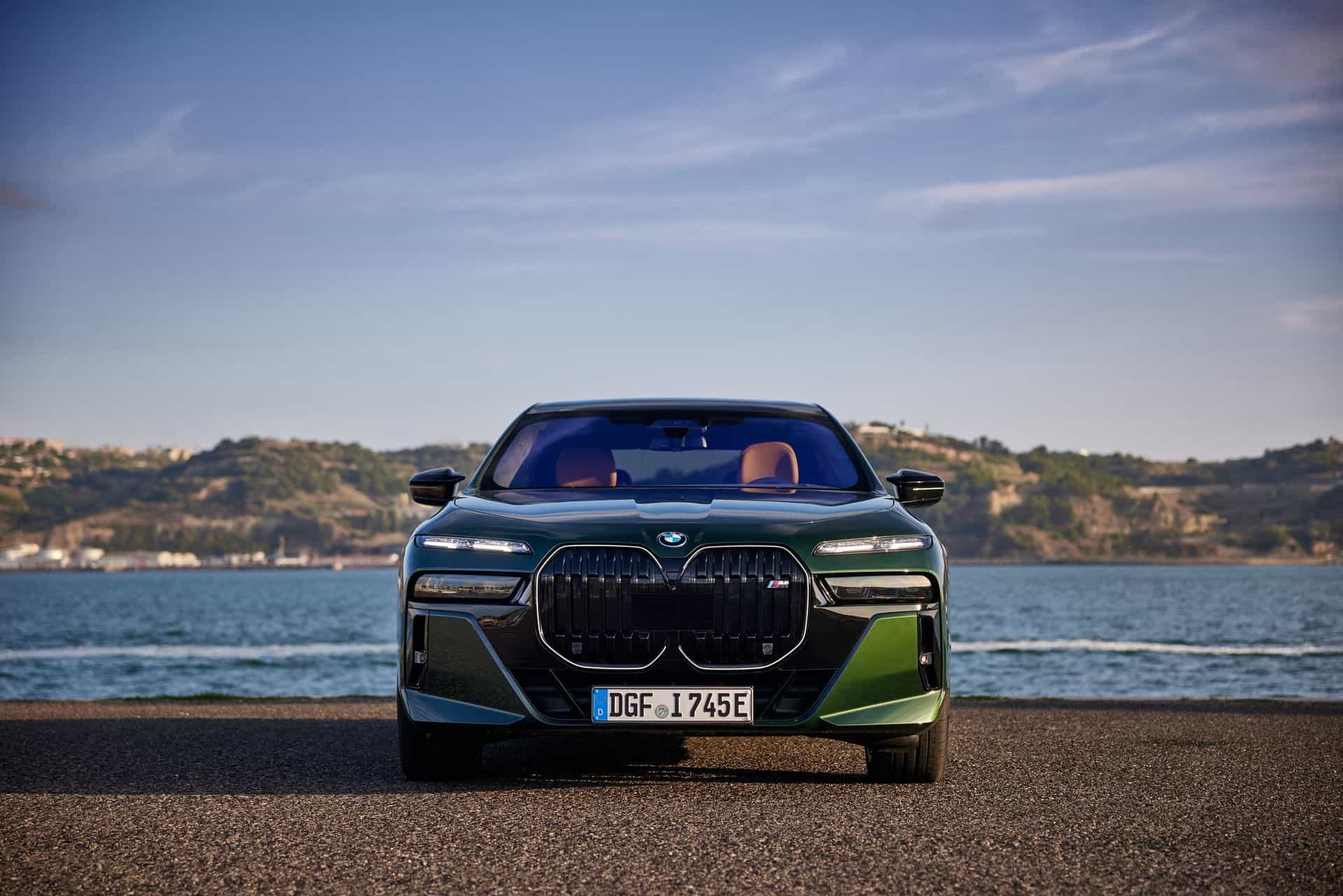
Today BMW showed us what it has been working for the past few years and finally revealed the BMW i4 Concept. Previewing the production model, the i4 Concept came with futuristic looks which, according to BMW, is 80 percent close to the production car.
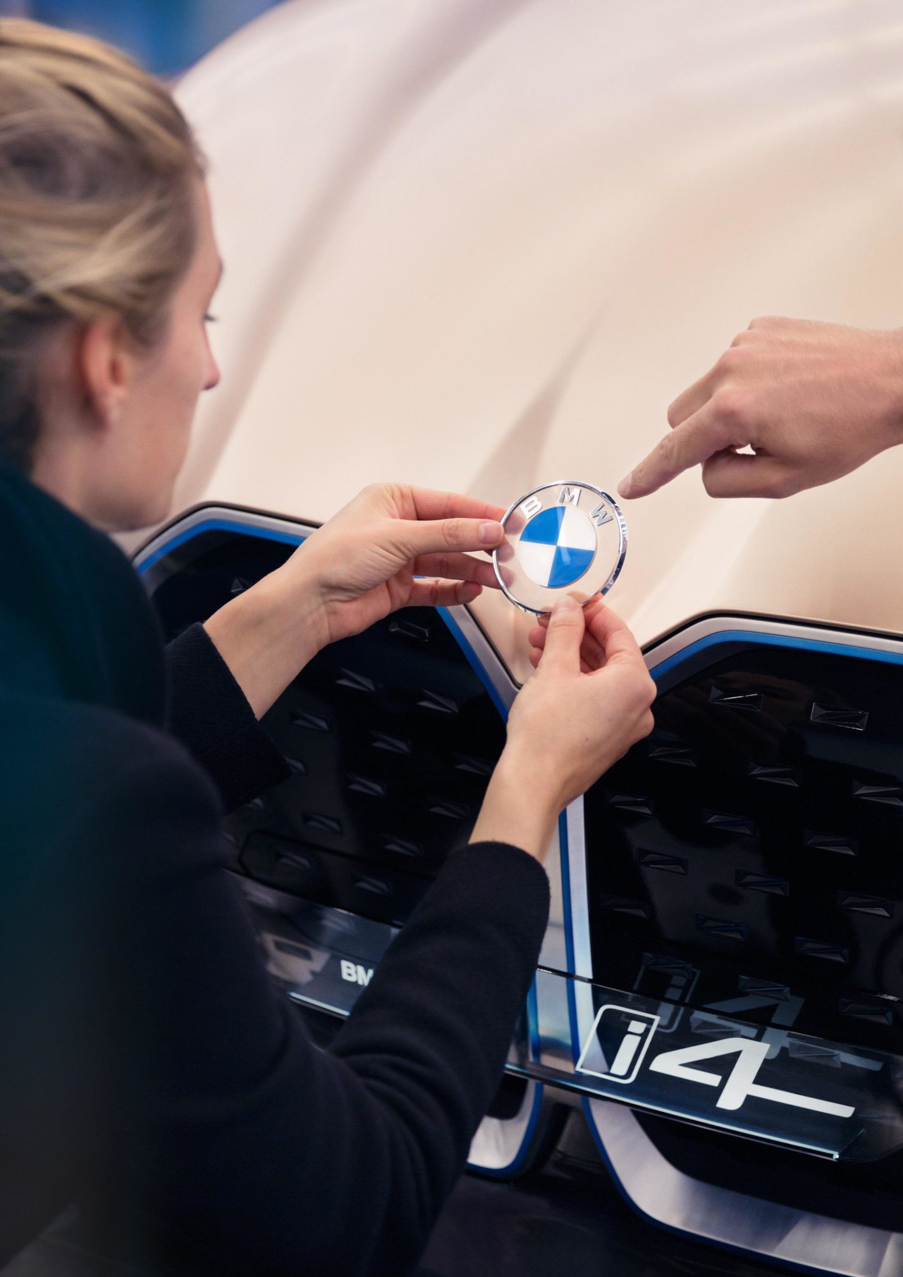
But those with a more keen eye also notice a couple of interesting details on the concept, including a different BMW logo and roundel sitting on the hood.
Now, don’t be panicked, according to a BMW spokesperson, the new logo will not be used on cars. It is mainly for communication purposes (online and offline).
Furthermore, concept cars can sport different badges and logos as they aren’t meant to be put in production in that exact shape. But even so, if BMW would change its logo it wouldn’t be the end of the world as other car makers have done so in the past as well, including brands with more history behind them.

As for the new logo, it looks good in my opinion. It has the same blue and white color scheme in the middle but a different, older font for the initials and a clear outer circle instead of the classic white one. This outer circle would have the same color as the car it is mounted on since it is transparent and I think it kinda works.
It’s also a flat 2D design which is a significant departure from the typical 3D design of their logo. Flat design works in some situations, but it comes with plenty of drawbacks. Flat shapes lack details that create depth and dimension, like shadows, highlights, and textures. So a 2D logo is not always easily recognizable.
What do you think? Should this design be adopted on all cars or only on EVs and plug-in hybrids?