With every new generation of customers, BMW is reshaping their identity. This thought process started over 100 years ago and it continues in 2020 with a new chapter in their book. In a recent call with Jens Thiemer, Senior Vice President BMW Customer Brand, we learned about some exciting changes in the identify of the Bavarian brand.
For starters, the iconic BMW roundel gets a new and fresh design. According to Thiemer, BMW has to adapt to a new customer base, a younger generation of buyers who are digitally natives.
“The new logo and brand design symbolizes the importance and relevance of the brand for mobility and the joy of driving in the future,” Thiemer told us.
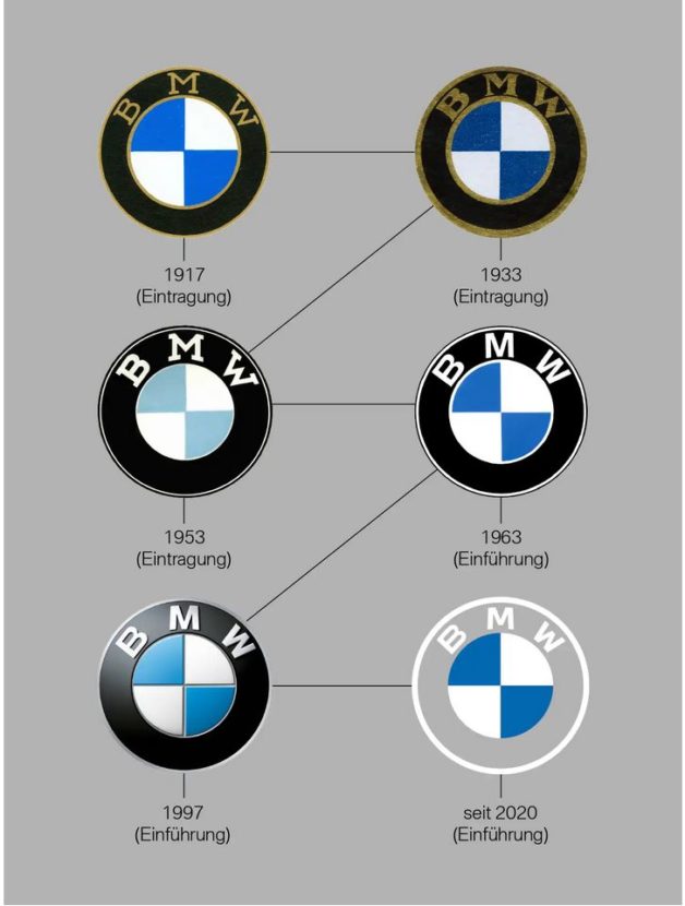
The new BMW logo retains the same shape, but its within this shape that the design takes a new approach. The middle still has the blue and white colors of the Bavarian state. The font has also been shaped up differently. The outer ring now has a flat design in white, while some gradients fill the rest of the logo.
Furthermore, Thiemer says that since “BMW is becoming a relationship brand”, the new logo will invite customers to rediscover the brand with its history and products.
With the visual and identity changes, BMW wants to be perceived even more openly and more accessible. It also marks the start of the electric revolution at BMW, alongside the BMW Concept i4 electric car.
The company’s sub-brands – BMW i and BMW M – are also getting their own new logos. The ///M badge is now flat, a 2D interpretation of “The Most Powerful Letter In The World”.
The i sub-brand continues down the same path with a refreshed look which will be part of the future electric and plug-in hybrid family.
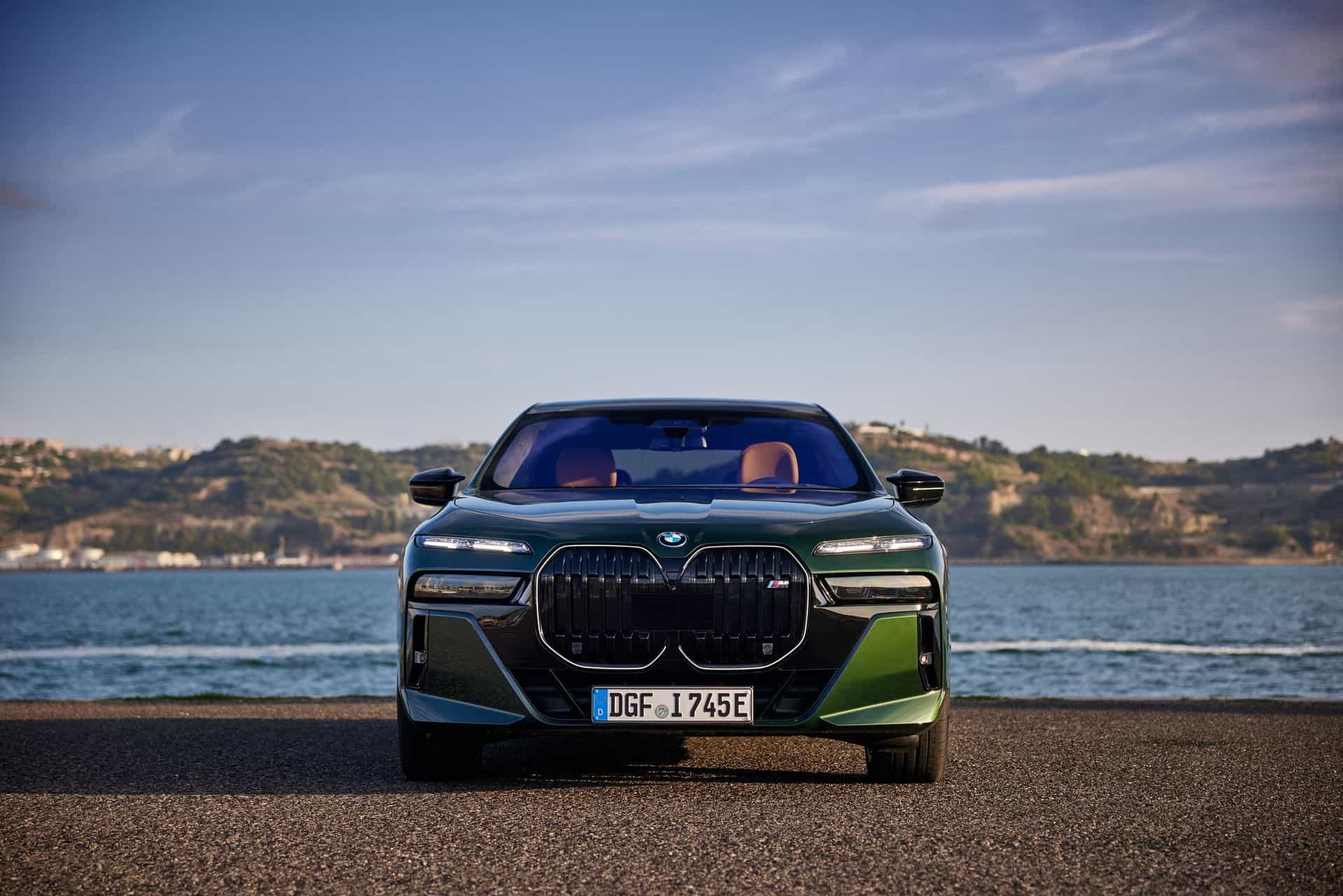
So far, no plans to have the new logo on cars. It mainly is for communication purposes (online and offline).
To highlight the evolution of their roundel/logo, BMW published a new graphic which remind us of the changes in the last decade.


