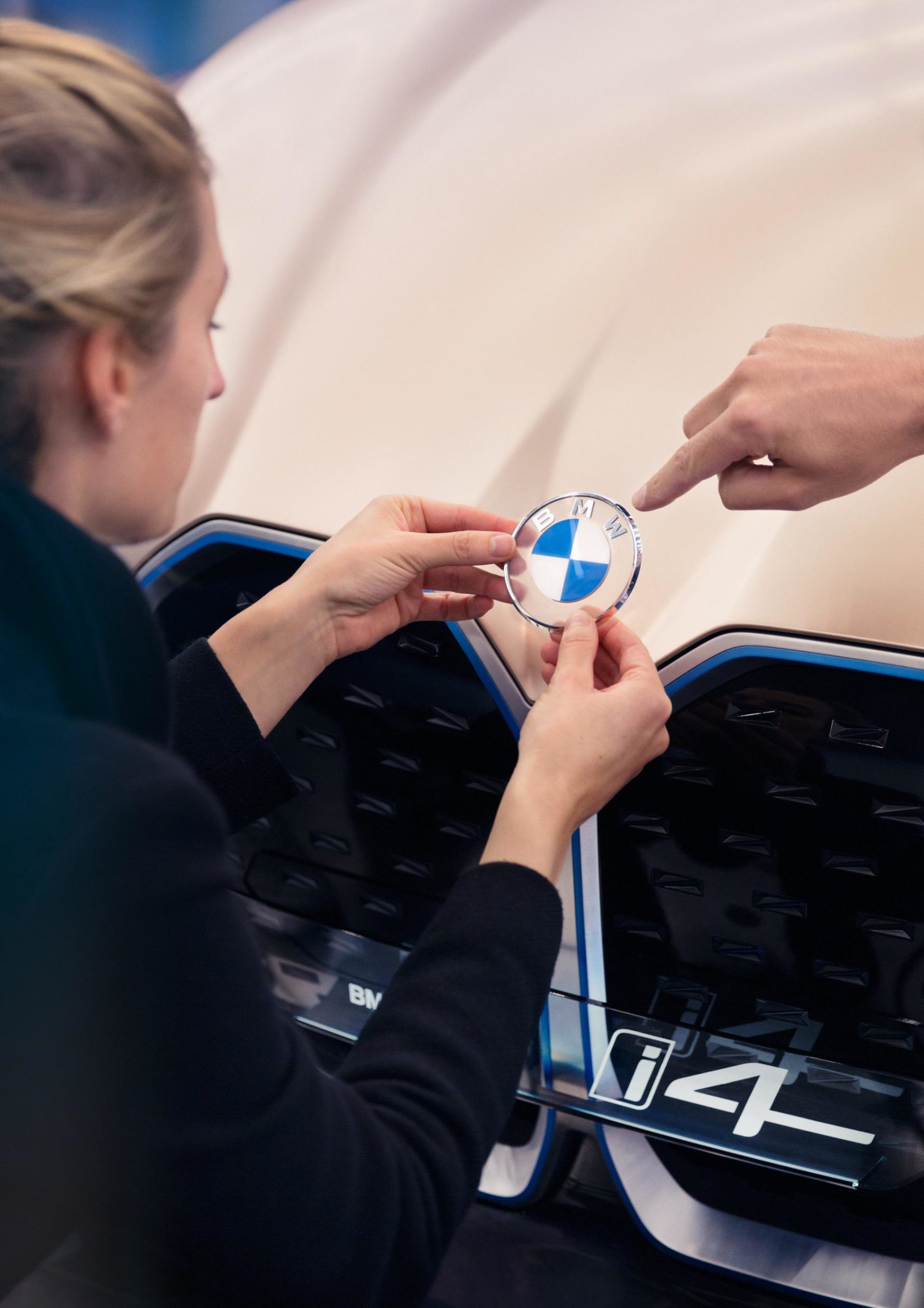
A small online storm was triggered last week when BMW unveiled a new logo. The iconic BMW roundel received a new and fresh design, but without the 3D shapes of the previous logo. The middle still has the blue and white colors of the Bavarian state. The font has also been shaped up differently. The outer ring now has a flat design in white, while some gradients fill the rest of the logo.
For the moment, BMW has no plans to the transparent logo on production cars. Instead, when it comes to online marketing, some changes were deemed as necessary.
In a recent interview with Adage, BMW’s head of the US marketing department, Uwe Dreher, explained why this move was approved.

“When it comes to a world where most people, especially younger audiences, consume communication on a smartphone, then you don’t need a super complicated or complex logo anymore, which is very, very detailed and comes from a time 20 years ago where we were proud to have a complex logo.”
“Now you have these little screens and this complexity has no benefit anymore. It even limits us sometimes. That is why we simplified the logo,” he said.
The backlash was also kind-of expected. This isn’t the first time BMW changed its logo and it probably won’t be the last time either and, every time they touched the famous roundel, a reaction was promptly stirred up.
“When you touch your logo after 20 years, there are of course people who have an opinion on that. And to be honest that is absolutely alright. In this day and age, I even appreciate the dialogue,” added Dreher.
![]()
For the moment though, the new logo will only be used online for marketing purposes, a move that’s expected to give BMW some feedback on whether the new look should be used on production cars as well.
We could see the new design used on future models though. My bet is that electric vehicles like the i4 and iNext could end up using this futuristic logo.