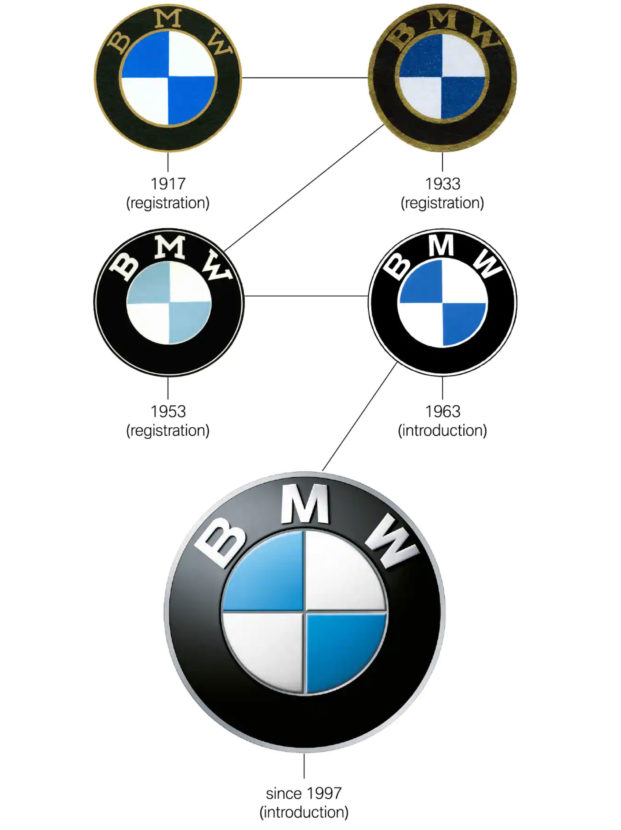
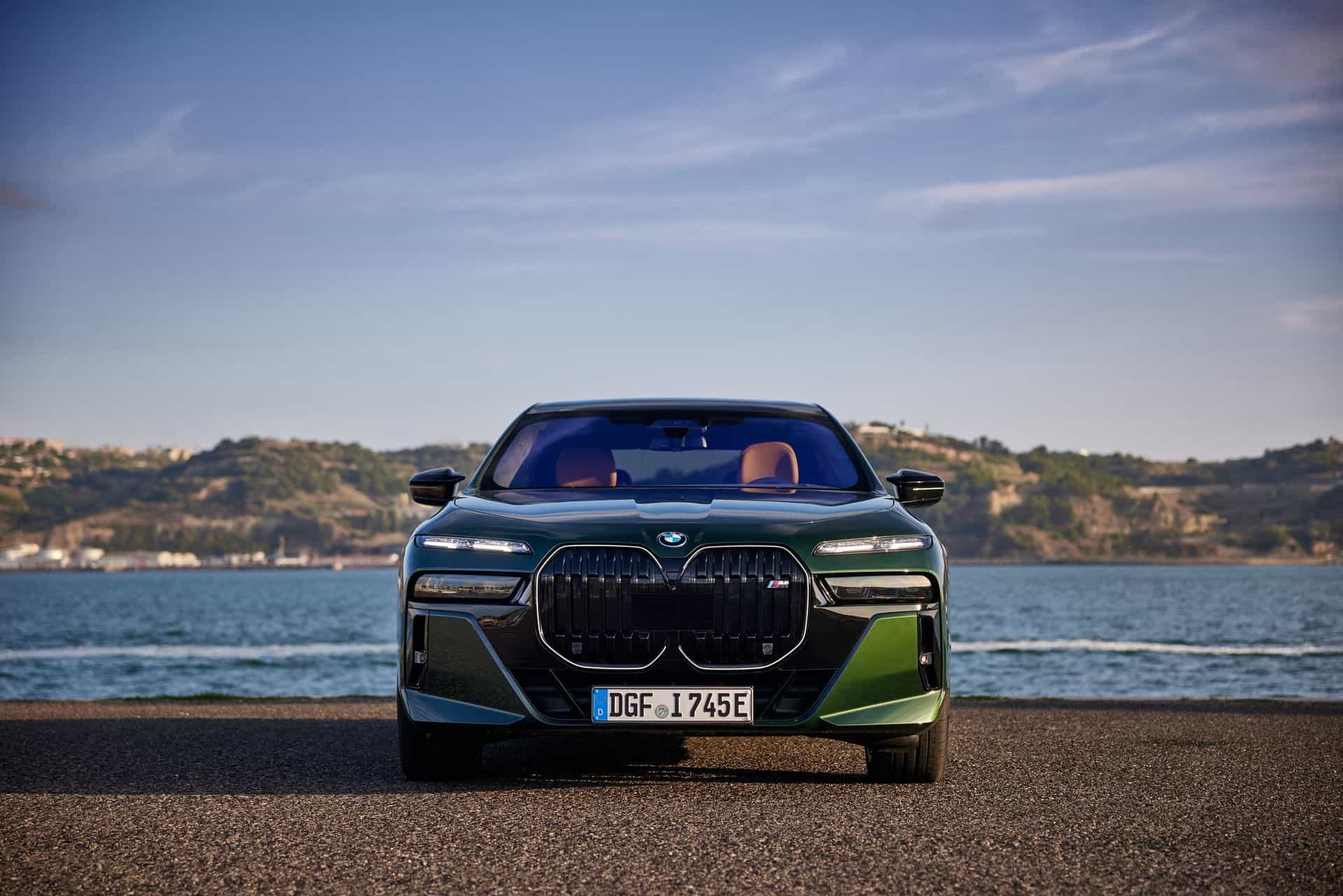
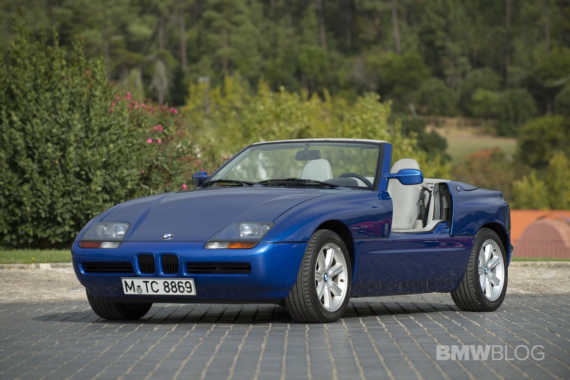
People have been talking about the meaning of the BMW logo for literally decades. Officials have been adamant about what it is supposed to mean, but some people always thought they knew best. Ask random people on the street where it comes from and you’ll probably get a myriad of different answers. To put an end to any sort of speculation, the Germans published a story about the origins of the Roundel.
There were two main theories about what the blue and white roundel stood for. One claimed it was supposed to represent the sky seen through the moving propellers of an airplane. Why so? Because at the beginning, BMW actually built airplane engines. Well, to be more precise, it wasn’t even called BMW back then but rather Rapp Motorenwerken. That was back in 1913. However, if you ever googled Rapp Motorenwerken, you might’ve noticed that company had a different logo altogether, with a horse right in the middle of it.
“The logo and the meaning of the symbol weren’t really in the limelight in the early days,” explains Fred Jakobs, Archive Director, BMW Group Classic. “In those first few years, BMW just wasn’t present in the public consciousness.” Business consisted mainly of the licensed production and maintenance of aircraft engines for the newly-formed German Air Force (Luftwaffe).
BMW ad in 1929
How do you get to the famous roundel from that?
As it turns out, it’s all because of a 1929 ad, promoting the brand, an ad you can see right above. The same motif was used again in another ad run in 1942 and that was enough to create a myth. BMW had a part to play in this as well though, as the company made little effort to contradict these theories over the years, according to Fred Jakobs, Archive Director, BMW Group Classic.
But no, that’s not what the emblem represents. Instead, it is meant to be a representation of the Bavarian flag, which also features the white and blue colors.
The BMW.com website says the following:
On October 5th, 1917 the young firm received a company logo. This first BMW badge, which was registered in the German Imperial Register of Trademarks, retained the round shape of the old Rapp logo. The outer ring of the symbol was now bounded by two gold lines and bore the letters BMW.
The company’s home state of Bavaria was also to be represented on the company logo. The quarters of the inner circle on the BMW badge display the state colors of the State of Bavaria – white and blue. But they are in the inverse order (at least as far as heraldic rules are concerned, where you read clockwise from the top left). The reason for this inverse order of blue and white in the BMW logo was the local trademark law at the time, which forbade the use of state coats of arms or other symbols of sovereignty on commercial logos.
Therefore, the BMW’s roundel had to be adapted. That’s because the law back in the early stages of the 20th century forbade companies to use the state’s coat of arms for commercial purposes. Thus, the BMW logo was altered just enough to make sure it wasn’t causing any problems.
You can read all about it in a special post on BMW’s website.


