If you live in a metropolitan area, the BMW logo with the iconic blue and white is everywhere you look. BMW manufactures and sells hundreds of thousands of vehicles each year. Despite the ubiquity, you’ll probably get just as many answers if you ask those drivers what the badge on the back of their car really means. Here’s a deeper look at what one of the most iconic logos on the planet really means.
1917: First BMW Logo
![]()
The first iteration of the BMW logo, as we know it today, debuted on October 5th, 1917. BMW emerged from the firm Rapp Motorenwerke GmbH, borrowing the circular shape and black surrounding ring from its logo. The center of the logo—the blue and white part that remains recognizable today—comes from the Bavarian flag. The colors are inverted, as local trademarks forbid using state symbols and the like on commercial logos.
![]()
Most of us have probably heard the rumor that the blue and white represents a plane propeller. While that is not the case – it is strictly an homage to the Bavarian flag – there is a story behind the misinterpretation. In November 1929, for the second edition of “BMW Flugmotoren-Nachrichten,” a promotional magazine by BMW, illustrator Henry Ehlers crafted a cover that depicted the BMW emblem set against the backdrop of a spinning airplane propeller. I hope that PR guy got a raise because nearly 100 years later, we’re still talking about it! BMW did little to discourage the myth – it was a great look for a company that makes airplane engines. They even ran similar ads throughout the next two decades.
1933: Second BMW Logo
![]()
The second iteration of the BMW logo emphasized the gold lettering and lines separating the outer ring from the center. The lines grew thicker and bolder, and the blue in the center got a bit darker. The typeface changed, too, giving the lettering a little bit more definition.
While this is how the badge was introduced in 1933, it evolved constantly through the next two decades. Cars and motorcycles produced around this time in BMW’s history used a huge variety of different badges, and indeed, a badge from a 1940 328 will share very little with something from, say, a 1949 BMW motorcycle.
1953: Third BMW Logo
![]()
The new logo features an overall softer look than its predecessor. Gold leaves the logo entirely, replaced instead with silver and white details. A thin white line surrounds the logo, and lighter shades of blue are immediately noticeable. This logo represented a dedicated effort to streamline the brand’s image – likely a result of the tumultuous WWII years.
It makes sense, then, that this logo began to appear – with minor embellishments – throughout the lineup. While BMW wasn’t making many vehicles around this time – somewhere around 3,000 a year – the branding was at least consistent. You can find this logo on the little Isetta subcompact and the BMW 503.
1963: Fourth BMW Logo
![]()
Just ten years after refining the logo for a third time, BMW introduced a significant change. The typeface changes again – similar to one you’ll see still today. The blue gets darker, and there’s a more pronounced white line surrounding the center. This badge was stuck on the decklid and hood of what would become some of BMW’s most iconic vehicles. From the original Neue Klasse to the E30 M3 and beyond, this logo remained unchanged for almost 35 years.
1972: BMW Motorsport Logo
![]()
The iconic M emblem adorned with three stripes wasn’t the inaugural logo for BMW M GmbH, established in 1972 and initially known as BMW M Motorsport until 1993. The first emblem was circular, showcasing offset semicircles in blue, purple, and red, with the central BMW logo of its parent company. This logo made its debut on the BMW 3.0 CSL in 1973.
The selection of these colors for the motorsport division’s design in 1972 involved key BMW personnel: Jochen Neerpasch (race director and co-managing director of BMW Motorsport GmbH at the time), Wolfgang Seehaus (interior designer), and Manfred Rennen (exterior designer).
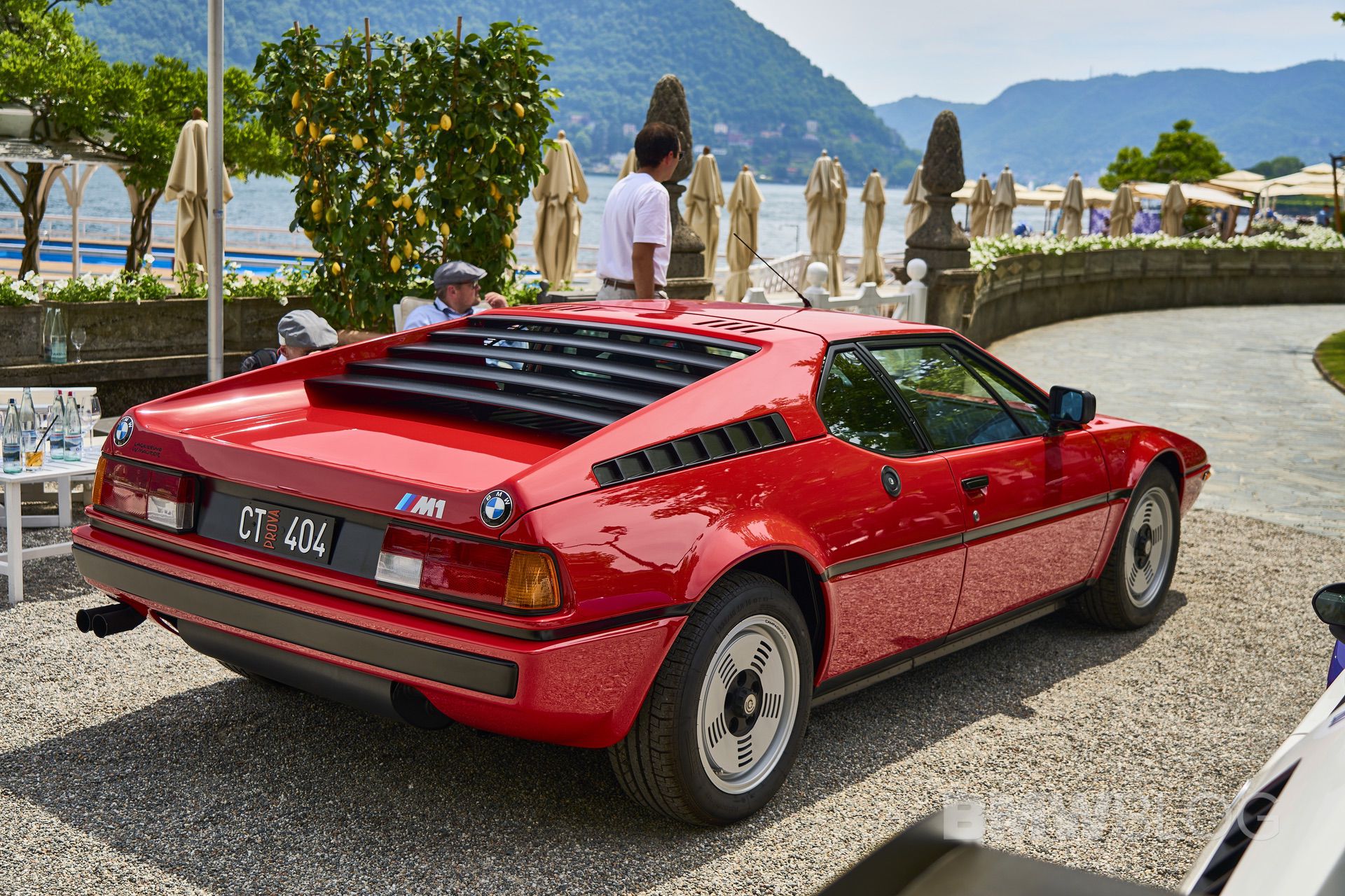
Although these colors were adopted for the BMW M series starting in 1973, it wasn’t until 1978, with the introduction of the BMW M1—the first car engineered by BMW M GmbH—that the “M” letter was integrated into the logo.
The practice of incorporating the BMW logo, with its characteristic concentric circle segments, began in 1973. The concept for this initial motorsport logo was conceived by the Swiss graphic design firm Müller, as recounted by Jochen Neerpasch. Through the decades, the M logo and stripes have been meticulously refined—for instance, substituting the original purple with a deep blue.
![]()
The most recent refresh of the brand’s visual identity occurred in March 2020, introducing a two-dimensional, four-color version of the BMW M communication logo—light blue, dark blue, red, and a white “M”—exclusively for brand messaging.
1997: Fifth BMW Logo
![]()
Why mess with success? After three decades, BMW decided to update the roundel again. But little really changed; the logo got a new 3D effect. Font remained sans-serif, and the white lines were perhaps toned down slightly to give the badge a more 3D look.

Notably, the fifth BMW logo does have some small variants depending on the model. BMW i cars like the i8 and i3 feature a blue circle surrounding the entire roundel. Hybrid models like the X5 xDrive50e get a similar look. Further tweaks come with the Heritage badges celebrating 50 years of BMW M, featuring a unique red, blue, and violet design surrounding the roundel. Interestingly, that design actually debuted in 1978 on the steering wheel of the BMW M1.
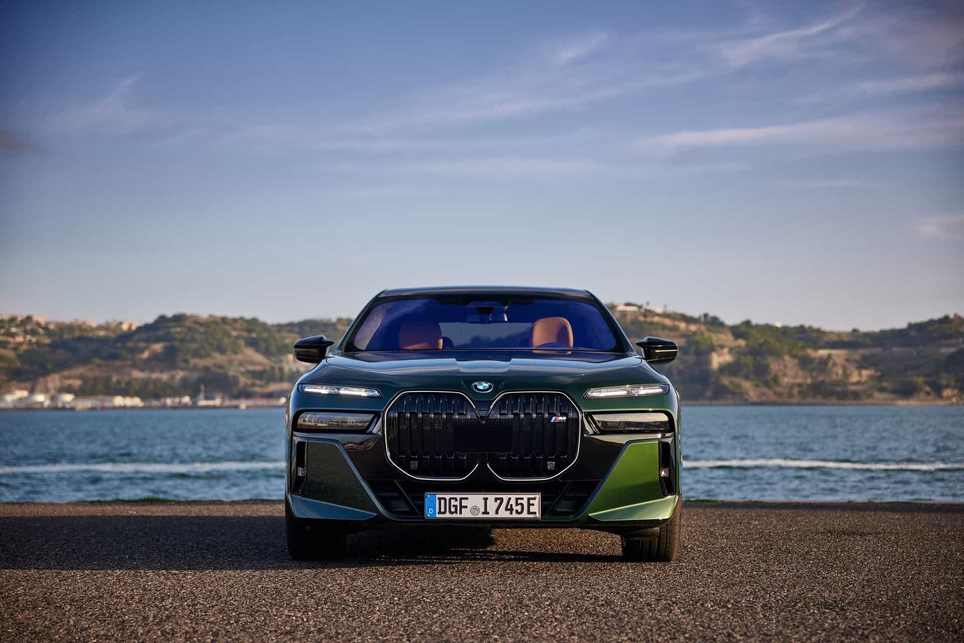
2020: Sixth BMW Logo
![]()
The newest iteration of the BMW logo is currently only used for brand communications. The transparent variant changes little besides its, well, transparency. Maybe they were tired of replacing the black ink cartridge at BMW HQ.
Whether or not my printer theory holds water, here’s another take. “The new communication logo radiates openness and clarity,” says Jens Thiemer from the Customer and Brand department. “We are equipping ourselves flexibly for the wide variety of contact points in communication at which BMW will show its presence online and offline in the future.”
![]()
![]()