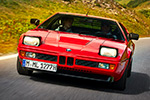
The BMW M1 Procar series only lasted two years, yet it still feels weirdly modern: identical cars, absurd driver lineup, and racing that mattered because nobody had a mechanical excuse. BMW ran it as a support show at European Formula 1 weekends in 1979 and 1980—five of the fastest F1 qualifiers dropped into matching M1s and went door-to-door with touring car aces and privateers. But here’s the thing: ask most enthusiasts what they remember first, and you won’t get lap charts. You’ll get paint. The M1 Procar silhouette is already a poster—mid-engine wedge, box flares, huge wing—so when you wrap it in period sponsor graphics, it becomes motorsport pop art whether you meant it to or not.
So let’s do this properly: the most memorable, verifiably real M1 Procar (and closely related period M1 race) liveries—plus one Nürburgring special you just reminded me deserves to be in the conversation.
The works look: BMW Motorsport stripes, plus peak-‘79 Marlboro

BMW’s own Procar retrospective leans into the basics: the factory M1s in Motorsport colors, the “this is what BMW M looks like” blueprint that’s echoed for decades.

And then there’s the ultra-period punch of Marlboro on the works entries—one of those combinations (white/red/black on a sharp wedge) that simply can’t look bad. This entry was listed with Marlboro sponsorship on a works M1. Those were the days when advertising campaigns had no limits.
BASF: the target graphic that made a chemical company look cool

If you’re picking with your eyes, the BASF Procar is a front-runner. BMW Classic itself has highlighted the M1 Procar in “classic BASF livery,” and it’s hard to argue—those concentric circles look like they were designed around the M1’s angles.
Cassani’s two-car masterclass: UHER and Kreistelefonbuch

Manfred Cassani’s camp basically offered two opposite design philosophies and both landed. Hans-Joachim Stuck’s car wore UHER in a stark, high-contrast scheme, and another entry with “Sponsors: UHER” and black/white colors.

The sister car (Manfred Winkelhock) went full highlighter: Kreistelefonbuch in yellow with black accents black—documented in chassis history as the “yellow and black colors” of its backer.
Denim: blue-and-white, perfectly tailored to the wedge

Some liveries look like they’re fighting the shape. DENIM looks like it’s following the crease lines with a ruler. Chassis history notes that a former Jim Beam-backed car later served in the team’s “handsome blue and white Denim livery” for 1980.
Jim Beam: the “booze racing” template done right

The Jim Beam car is peak Procar energy—clean white base, bold color blocks, and sponsor placement that doesn’t clutter the body. This 1979 Procar M1 was adorned with “Sponsors: JIM BEAM/WINNEBAGO” and the white/red/green color layout. And a separate chassis record confirms the same car appeared in 1979 with Jim Beam backing (plus other period sponsors).
Gösser Beer: Austria’s rolling flag

You asked for the green one—and yes, it’s a real, properly documented Procar look. Driven by Dieter Queste, this BMW M1 Procar raced with the Gösser Beer sponsors in green/red/white colors. (If you’ve ever wanted a livery that looks like it came with a passport stamp, this is it.)
Buler: the Swiss watch flex

Buler belongs in this list because it’s exactly what a one-make “everyone’s equal” series needs: a crisp, identifiable privateer scheme that looks expensive without being loud. The BMW Schweiz entry had white/red colors.
Abel Lepitre: Monaco, champagne, and the right kind of red/white

Walter Brun’s Abel Lepitre sponsorship is one of those combinations that feels impossible to separate from the era. The archives tie Brun’s M1 entries to Abel Lepitre sponsorship and the white/red colors.
The Nürburgring map car: Stuck/Piquet and “Ja zum Nürburgring”

If your favorite M1 livery is the one that looks like someone traced the Nordschleife across the bodywork, you’re not imagining it. BMW Motorsport entered a Procar-bodied M1 as car #201 for the 1980 ADAC 1000km Nürburgring, and it wore a “Ja zum Nürburgring” design whose graphics echo the circuit itself. With Hans-Joachim Stuck and Nelson Piquet sharing the drive, the M1 finished third overall and topped its class—an M1 that literally carried the ‘Ring on its skin while it fought at the ‘Ring
French flair, Le Mans attitude

BMW France “Carte de France” (often linked with Antar). This is the livery for people who love details. The “Carte de France” M1 is literally a map-themed design tied to BMW France’s Le Mans efforts—an idea so French it almost can’t be replicated elsewhere. Period references also connect the concept to Antar sponsorship in the BMW France orbit.
VSD

If you want an M1 wearing proper endurance-racing identity (and some very French team energy), the VSD/Zol’Auto car is a must-mention, complete with that wonderfully specific driver trio.
ALPINA and the “how did this exist?” category.

There are plenty of modern ALPINA greens and golds that look great, but the black/white ALPINA-branded M1 competition look is a different flavor—more graphic, more aggressive, and surprisingly natural on the M1’s sharp surfaces.
Warhol: not Procar, but the M1 livery that transcends motorsport

The Andy Warhol BMW M1 Art Car isn’t a Procar-series entry—but it’s still a full-race M1 silhouette, and it’s the one that turned the car into a traveling museum piece. Le Mans’ organizers call it an “absolute icon” and note it finished sixth overall at the 1979 24 Hours of Le Mans.
And yes, there are more (because Procar is a livery rabbit hole). Once you start scrolling period entries, you realize the grid was basically a rolling sponsor catalog. RacingSportsCars’ Procar listings show additional flavors like AIR PRESS, MEMPHIS/SCHNITZER, ARVOR/TOTAL, and others.
Your turn
Alright: pick one. No ties, no “depends on the angle,” no “today I feel like…” Are you team BASF target, UHER Cassani, Kreistelefonbuch yellow, DENIM blue/white, Jim Beam, Gösser green/red/white, Buler Swiss clean, Abel Lepitre Monaco, the “Ja zum Nürburgring” map car, or are you going full culture with Warhol?